
Examples of Custom Coffee Branding for Entrepreneurs

Custom coffee branding is the practice of building a distinctive visual identity, packaging style, and brand story that connects your coffee to a specific customer at first glance. The best examples of custom coffee branding share three traits: a clear logo, packaging that communicates flavor and origin, and a story customers want to repeat. Brands like George Howell Coffee and BRYN Coffee House prove that strong coffee brand identity does not require a massive budget. It requires clarity, confidence, and a design system that works at shelf level.
What makes custom coffee branding work?
Custom coffee branding succeeds when every visual element earns its place. Your logo, typography, packaging format, and color palette must all point toward the same brand personality. Entrepreneurs who treat these as separate decisions end up with packaging that looks assembled rather than designed.
The foundation is a confident logo and type system. Typographic confidence and bold color fields create immediate brand recognition, as BRYN Coffee House demonstrates with its oversized letterforms and single red accent in an otherwise neutral market. That approach works because the eye has one clear place to land.
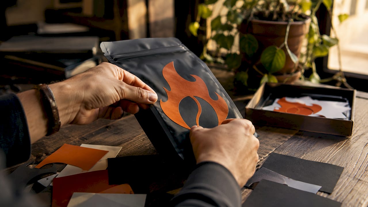
Flavor communication is equally critical. Clarity in branding improves customer choice and loyalty, which is why George Howell Coffee uses visual flavor palettes instead of dense tasting notes. Customers select coffee more confidently when the system is intuitive rather than technical.
Sustainability messaging now belongs on the packaging itself, not just on a website. Brands that print with eco-friendly inks and use compostable materials signal values without a single extra word of copy.
Pro Tip: Use QR codes on your packaging to link directly to brew guides or farm origin videos. This turns a static bag into an interactive brand experience without adding print cost.
Key elements to build into your coffee brand identity:
- A clear logo with consistent typography across all formats
- A packaging format matched to your production volume and retail channel
- Origin photography or farm details that add perceived value
- Tasting notes translated into visual flavor systems, not just text
- Side panel copy that tells your brand story or highlights certifications
- Sustainable materials and finishes that reinforce premium positioning
- A roast date displayed prominently to signal freshness and transparency
7 standout examples of custom coffee branding
1. George Howell Coffee: flavor palettes as a design system
George Howell Coffee is one of the clearest coffee brand design examples in the specialty market. The brand uses a visual flavor palette system that translates complex tasting notes into color-coded, intuitive guides. Customers do not need a trained palate to choose confidently. The logo blends heritage and a modern sensibility, which signals both experience and relevance. This approach shows that great branding solves a real customer problem, not just an aesthetic one.
2. BRYN Coffee House: typographic confidence in a crowded market
BRYN Coffee House built its entire identity around one bold design decision: oversized typography and a single red color field against neutral tones. Strong typography and distinctive colors differentiate brands in a crowded market, and BRYN proves that restraint in color amplifies impact. The brand does not need illustration or complex iconography. The type does all the work, and that confidence reads as premium.
3. Minimalist packaging: letting white space signal quality
Restrained minimalism with white space and single color marks is a proven trend in premium coffee packaging. Brands that strip away decoration force the customer to focus on the product name, origin, and roast profile. This approach works especially well for single-origin coffees where the bean’s story is the selling point. A clean matte bag with a small, precise logo communicates confidence in the product itself.
4. Farm photography and origin storytelling on the bag
Including farm photography or origin details on coffee packaging can increase willingness to pay by 15–20%. That is not a small lift for a retail product. Brands that photograph the actual farm, name the farmer, and show the growing region create a direct emotional connection between the customer and the source. This strategy works across price points, from grocery retail to specialty subscription boxes.
5. Universal bag with SKU-specific labels
A universal bag strategy with SKU-specific labels reduces inventory complexity and supports frequent product rotation. Small roasters print one base bag design in volume, then apply individual labels for each single-origin or seasonal blend. This keeps minimum order quantities low and allows the brand to rotate offerings without reprinting full packaging runs. The Flaming Bean’s approach to distinct blend names like Abyssal and Angry Rooster shows how strong naming can carry a label-based system.
6. Side panel storytelling
Side panel real estate on bags is critical for secondary branding and origin stories, yet most small roasters leave it blank. Flat-bottom and quad-seal bags offer generous side panels that influence how a product reads on a retail shelf. Brands that use this space for farm narratives, brewing instructions, or mission statements turn a functional surface into a brand touchpoint. This costs nothing extra in design terms and adds real shelf presence.
7. Purpose-driven branding tied to a cause
Some of the most memorable unique coffee branding strategies connect the product directly to a social mission. The Flaming Bean’s Safe Ground blend is a strong example: the packaging communicates both the coffee’s quality and its connection to protecting vulnerable communities. Cause-driven branding creates loyalty that goes beyond flavor preference. Customers who share your values become repeat buyers and vocal advocates.
“The best coffee packaging does two things at once: it sells the coffee and it tells you who made it and why. If your bag only does one of those, you are leaving loyalty on the table.”
Comparison: digital printing vs. rotogravure for custom coffee packaging
| Factor | Digital printing | Rotogravure |
|---|---|---|
| Best run size | 500–5,000 units | 10,000+ units |
| Cost per unit | $0.35–$0.80 | $0.12–$0.30 |
| Design flexibility | High, easy to change | Low, requires new plates |
| Color fidelity | Very good | Excellent |
| Best for | Small roasters, seasonal SKUs | Large-scale production |
How to choose packaging and printing for your coffee brand
Stand-up pouches represent 45% of retail coffee bag sales in North America as of 2025. That dominance reflects their practical advantages: they stand upright on shelves, seal well for freshness, and offer large printable surfaces. Tins and rigid boxes work for premium gift positioning but cost more per unit and add shipping weight.
Printing method selection depends entirely on your production volume. Digital printing costs $0.35–$0.80 per unit for runs between 500 and 5,000 units, while rotogravure drops to $0.12–$0.30 for runs above 10,000. Small roasters who choose rotogravure for small runs overpay significantly, and they lock themselves into large inventory commitments.
Sustainable materials matter more than ever to specialty coffee buyers. Compostable kraft bags, water-based inks, and recyclable tins all signal environmental responsibility without requiring a paragraph of explanation. The material choice communicates the brand value before the customer reads a single word.
Pro Tip: If you are launching a new blend or testing a seasonal offering, start with digital printing at 500–1,000 units. You protect your budget, test the design in market, and avoid sitting on unsold inventory.
Packaging format options at a glance:
- Stand-up pouches: Best all-around choice for retail; cost-effective, shelf-stable, and highly printable
- Flat-bottom bags: Premium look with wide side panels for storytelling; slightly higher cost
- Tins: Strong for gifting and premium positioning; higher unit cost and shipping weight
- Kraft boxes: Great for subscription packaging; pairs well with inner bag for freshness
How to use storytelling and flavor communication in your branding
Farm photography and origin stories are the fastest way to build emotional connection on a coffee package. Naming the farm, the country, and the farmer transforms a commodity product into a personal one. Brands that do this well see measurable increases in repeat purchase rates, because customers feel they know the source.
Flavor communication needs to be visual and immediate. Dense tasting note text in small print does not help a customer at shelf. George Howell Coffee’s flavor palette system shows that intuitive visual systems help customers choose with confidence. A simple color spectrum or icon-based guide works far better than a paragraph of descriptors.
Roast date transparency builds trust. Printing the roast date prominently tells the customer you are proud of your freshness standards. It also differentiates specialty roasters from mass-market brands that hide or omit this information entirely.
QR codes add a digital layer to physical packaging without cluttering the design. Link them to brew guides, farm videos, or your brand story. This is especially effective for bold specialty coffees where the brewing method significantly affects the final cup.
Key takeaways
Strong custom coffee branding requires a clear visual identity, packaging matched to your production volume, and a story that connects the customer to the source.
| Point | Details |
|---|---|
| Lead with clarity | A clear logo and intuitive flavor system help customers choose confidently at shelf. |
| Match printing to volume | Use digital printing for runs under 5,000 units to control cost and maintain flexibility. |
| Use origin storytelling | Farm photography and named origins can increase willingness to pay by 15–20%. |
| Maximize side panels | Use bag side panels for brand narrative, certifications, or brewing instructions. |
| Consider cause-driven branding | Connecting your coffee to a mission builds loyalty beyond flavor preference. |
What I have learned from watching coffee brands win and lose at shelf
The brands that struggle most are not the ones with bad coffee. They are the ones with confused packaging. I have watched roasters spend months perfecting a roast profile, then slap a generic label on the bag and wonder why sales stall. The packaging is the first conversation your brand has with a customer, and it happens in about three seconds.
The biggest mistake I see from small roasters is choosing printing methods based on what sounds professional rather than what fits their volume. Rotogravure sounds impressive, so new roasters assume it is the right choice. It is not, unless you are moving serious volume. Digital printing gives you the flexibility to test, adjust, and rotate SKUs without financial risk.
I also think the coffee industry underestimates the power of a cause. Customers who buy a coffee because it supports something they believe in do not just come back. They tell other people. The Flaming Bean’s purpose-driven blends like Safe Ground are a model worth studying, because the branding does not separate the mission from the product. They are the same thing.
The future of coffee branding belongs to brands that treat the bag as a full storytelling platform, not just a container. Every panel, every finish, and every font choice is a decision about what you stand for.
— Tony
Bring your coffee brand to life with The Flaming Bean
We love helping entrepreneurs find coffees that represent their brand perfectly. At The Flaming Bean, we offer a range of specialty blends built for bold, memorable brand experiences.
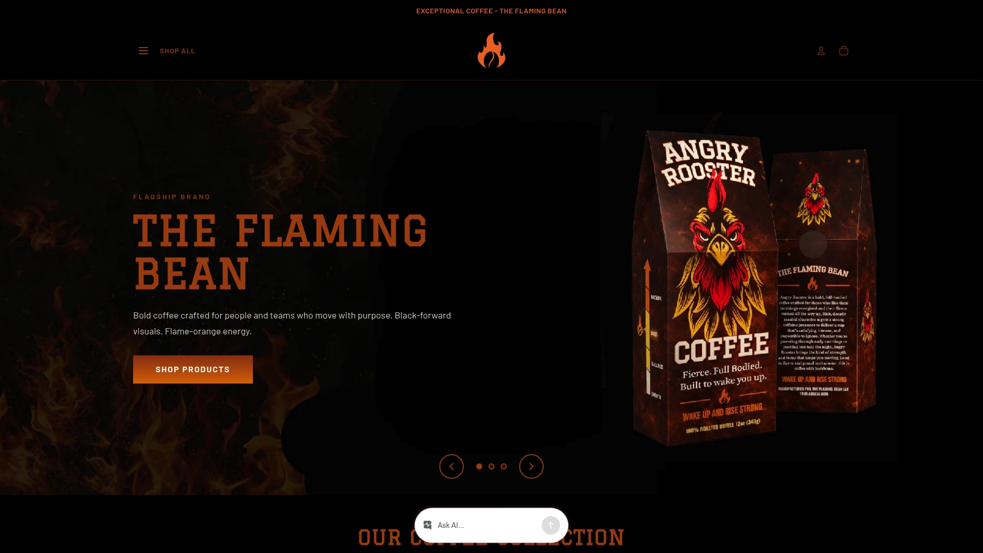
Whether you are building a wholesale program or looking for a signature blend that tells your story, our wholesale options make it easy to get started. Our purpose-driven blends like Safe Ground and our full signature blends collection give you a strong foundation to build a brand your customers will remember. Reach out today and let’s find the right coffee for your brand.
FAQ
What are the core elements of custom coffee branding?
Custom coffee branding combines a clear logo, distinctive packaging, flavor communication, and an origin story. These elements work together to create a brand identity customers recognize and trust.
Which packaging format is best for small coffee roasters?
Stand-up pouches are the most practical choice, representing 45% of retail coffee bag sales in North America. They balance cost, shelf appeal, and printable surface area well for small roasters.
When should I use digital printing vs. rotogravure for coffee bags?
Use digital printing for runs of 500–5,000 units at $0.35–$0.80 per unit. Switch to rotogravure only when your volume exceeds 10,000 units and the lower per-unit cost justifies the setup investment.
How does origin storytelling affect coffee sales?
Including farm photography or origin details on packaging can increase consumer willingness to pay by 15–20%. Named farms and farmer portraits create emotional connections that generic product descriptions cannot match.
What is a universal bag strategy for coffee packaging?
A universal bag strategy uses one base bag design printed in volume, with individual SKU-specific labels applied per blend. This keeps minimum orders low and allows frequent product rotation without full reprints.
Comments